
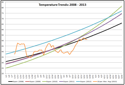
This is a chart of the temperature trends since 2008 for Bloomington, IN. The only real divergence from the norm was in 2012, when the temperatures ran significantly higher than normal for most of the period. This is the reason why morels appeared so early that year.
The trend line in orange shows a 10 day moving average for 2013. It appears that the ultimate trend will fall very close to the norm.
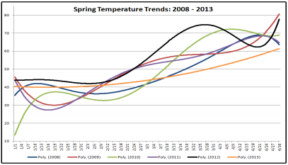
This chart shows the trends a little more in depth. It was above previous years most of the time, but the temperature took a big upturn in early/mid February, and didn't start to come back to the norm until the end of March.
NOAA Climate Prediction Center - Temperature Forecast
Find temperature data for your area:
Recommended Comments
There are no comments to display.